


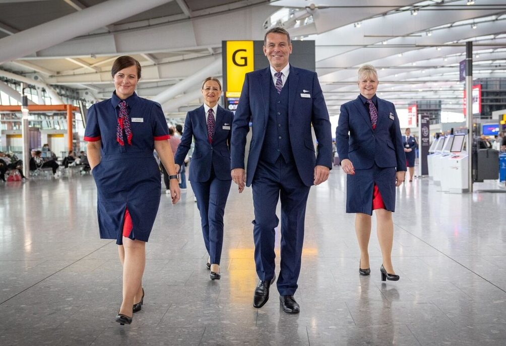
In October 2023, British Airways rolled out what has gone down as perhaps the airline’s most controversial cabin crew uniform ever. Female staff were left aghast at the ‘hideous’ designs that they complained made them look and feel like men, and within months, BA admitted that the uniform wasn’t “quite hitting the mark.”
Despite that admission, however, it’s taken the airline well over a year to respond to the barrage of complaints from frustrated employees.
How did the airline finally respond? By removing the last bit of femininity from the initial designs – that’s, at least, the complaint from female workers who have seen the remodeled designs.
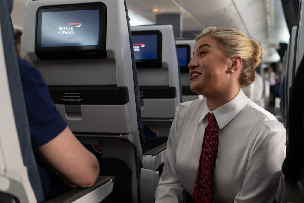
At the center of the latest controversy over the uniform, British Airways has decided to eliminate a frilly neck scarf worn by female cabin crew and replace it with a piece of fabric known as a twilly.
What exactly is a twilly, I hear you ask? Well, the history of the twilly can be traced back to the luxury fashion house Hermès, which first introduced the radical new neck scarf in the 1930s.
A twilly is a narrow scarf, typically measuring just 2 inches wide, which can be worn in a variety of ways around the neck or head.
In recent years, the bold Hermès print twillies have gained a new popularity amongst influencers and the ultra-rich who use the scarves as a wrap around the handles of their Birkin and Kelly handbags.
Given the luxe connection, you would have thought that BA’s cabin crew would be pleased with their new scarves, but it appears that the airline isn’t permitting any of the traditional versatility that they are worn.
Instead, BA’s twilly is only allowed to be worn with the scarf wrapped around the back of the neck and two long strips hanging down. It is then secured with what appears to be a tie pin.
Female staffers say the guidelines make it look like they are simply wearing a man’s necktie.
The twilly isn’t, however, the only new controversial addition to the female cabin crew uniform. In response to complaints that a sheer ivory-colored blouse was too see-through, the airline is also in the process of rolling out a much thicker shirt in a white colorway that closely resembles men’s shirting.
The latest uproar comes just months after British Airways was forced into an embarrassing climbdown over new uniform and appearance rules that banned pilots and cabin crew from drinking coffee in public and required them to only consume water “discreetly.”
In an internal memo announcing the U-turn, British Airways admitted that the guidelines had “given the impression” that eating and drinking had been banned, but the airline claimed that this was never the case.
First announced in 2019, BA’s new uniform project brought in famed Savile Row designer Ozwald Boateng to reimagine the airline’s cabin crew look. Unfortunately, the COVID-19 pandemic put the project on hold, and it would be another three years until the designs were eventually revealed.
To say that the eagerly anticipated reveal fell flat would be a massive understatement. Staffers were furious with the final look, and the small changes so far announced by BA to address specific issues have done little to improve the perception of the uniform.
Matt’s Take – Perhaps it’s time for BA to do an Aliatalia?
Designing a new uniform is an expensive and time-consuming process, so you can understand why any company would want to avoid going back to the drawing board if at all, even remotely possible.
That being said, sometimes even struggling businesses know when to cut their losses and start over.
In 2017, the then national flag carrier of Italy, Alitalia, announced it was getting a new uniform after less than two years and despite the fact that the carrier was looking for a buyer because it was so financially distressed.
Designed by Italian Haute couturier Ettore Bilotta and first unveiled in May 2016, the short-lived Alitalia uniform was hated by staffers, from both a design perspective and practicality.
Alitalia justified the costly project, explaining that uniforms are normally reissued every two years, and, as such, the replacement program wouldn’t be much more than reissuing uniforms for normal wear and tear.

Although thw staff are of course the most important stakeholders does Waterside have any idea how dressing their staff (one if the sparingly few bits of excellence left) as fast food employees impacts the wider brand?
I strongly suspect (hint a blouse made of material so cheap it was at best opaque) that as with so many other changes this includes a huge element of cost cutting.
They should NOT have scrapped the beautiful Julien MacDonald uniform for this drab mess! What were they thinking?
I’m no longer there but I was new entrant cabin crew in the transition period between the old Julien McDonald being phased out and this new one coming in. We all expressed the opinion that the new uniform was underwhelmingly average in terms of impact and style, and a massive let down made worse by the 4 years delay. The trainers obviously were obliged to tow the party line, that it was wonderful and a fresh new look, etc, but it was obvious that they also felt it was just soulless and corporate. This in a nutshell is BA … getting folk from A to B is just a logistical task to be dealt with, whereas with the genuinely award winning airlines (Emirates, JAL, ANA, Singapore, el al) the focus includes trying to make the process at least somewhat elegant and beautiful. BA’s cabins, in my opinion, look like the interior of a morgue with a few dark blue tones chucked in, and the uniform matches this aesthetic. Contrast with Emirates: beautiful champagne tones, gold, etc. BA in my opinion, as a new member of staff coming in, fresh and energetic, quickly felt bludgeoned by what seemed to be a soulless, unloved corporate culture of surviving in a tough industry, one where what used to be called “Eros” just couldn’t exist. Great pity.
The uniform is hideous, looked outdated from the beginning, does nothing to favour women and unfortunately will have to be worn for much longer to financially justify what British Airways has invested in it. This is what you get when investing into diversity to appease the self-centred, egotistic minority so that the vast majority looks ridiculous. I will never forget that Ozwald Boateng himself did not advertise on his social media once the Uniform was released due to the negative backlash this monstrosity of uniform had received. He missed the mark.
Totally agree. They should scrap the horrible thing and restore the Julien MacDonald.
It really is the most disappointing BA uniform ever. The pilot uniforms are good, the male cabin crew look sort of ok, but the female cabin crew is a disaster. Oswald Boateng is a good Designer…I really don’t understand how it went so wrong. The material – weird Jersey jacquard reminiscent of 60’s crimplene – looks a mess. The trousers defy pressing! The skirts with the red front inverted pleat looks trashy. The blue dress is sort of ok. But it’s the fit which is so bad. The uniform looks like a badly fitting school uniform. Well it is badly fitting, and why is everything so tight? Is the sizing wrong? Is it shrink to fit? ITA Airways struck a deal with a major textile company AEFFE to produce the latest uniform at minimum cost. BA would need to do the same. I believe the original contenders were Paul Smith and Stella McCartney. Heavens, even M&S Autograph would have been better. Burberry could have been good too. Lufthansa have turned to BOSS for their new uniform and it’s that strong trustworthy brand which drivers.
Yes, they should just wear M&S Autograph or Reiss. They’d look effortlessly elegant and far more normal.
This was one of the wisest moves by the former Virgin America. They hired Banana Republic. They had stylish, distinctive, but normal uniforms.
I just don’t understand it. The Roland Klein uniforms are outdated now, but they looked smart, different, and showcased a new BA in the 80s. When I was at BA, it was the Costelloe uniform, which I still think looks smart and elegant. I cannot for the life of me understand what they’re doing now. The trend toward less “gendered” uniforms is understandable, but BA did a surprisingly poor job of executing this. They could offer a range of masculine to feminine styles and everything in between. Right now, they have something that doesn’t look like an airline at all, particularly not BA. It has almost “sad casino” vibe. Some of the odd styles “grow on you,” so to speak. This one doesn’t. It’s too strange. I would tell any airline trying to change their uniform to look at Air France. Just do what they do.
It’s not only the cabin crew uniform that is hideous, just talk to any member of ground staff and you’ll find that they all think the new uniform they have been supplied with is absolute rubbish. Poor materials and sizing but what do you really expect when it is sourced from China?
Poadddddd!
Why on EARTH did BA managers scrap the beautiful Julien MacDonald uniform for THIS mess?
Bring back the JM uniform and ditch this awful new design. The Boateng style is MASSIVELY unpopular.