


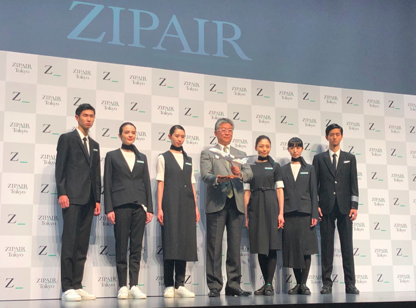
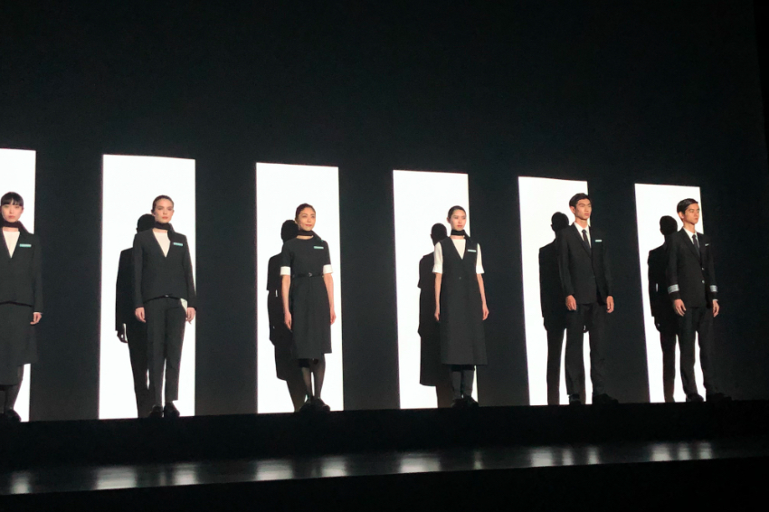
These new uniforms worn by flight attendants at yet-to-be-launched Japenese airline ZIPAIR are so edgy it almost hurts. The Taro Horiuchi-designed threads are certainly a far cry from traditional airline uniforms and wouldn’t look out of place on a Comme Des Garcons runway. They were unveiled today at an event in Tokyo along with some more confusing and equally bizarre snippets of information about the new airline.
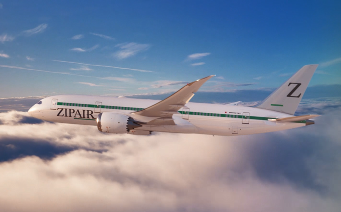
Set for launch in time for next year’s Tokyo Olympic games, ZIPAIR is a wholly owned subsidiary of Japan Airlines and will be the aviation group’s first low-cost long-haul airline. The design of the brand may well look like it’s been mocked up by a High School student on a mid-1990’s desktop computer as part of an extra-curricular assignment but it was actually put together at great expense by an award-winning creative design agency in Tokyo.
Apparently, the name is derived from the English word for Zipcode which is meant to describe speed and travelling fast. The official press release also goes into great detail, explaining:
“The brand name incorporates the idea of travelling to destinations in various ZIP CODES while aiming to create a calculated travel experience that encompasses the originality and ingenuity of the Japanese culture.” Okay then.
The explanation for the logo is even more confusing; “The logo mark of [Z_] is a symbol by combining ‘Z’, which means ‘ultimate’ in the first letter of ZIP, and space _, which expresses ‘AIR’. In addition, we call this blank Infinite Blank, and the trueness of the ever-changing times and customers to continue being an airline aiming for the future. We will continue to pursue services that meet the needs of our customers infinitely.”
As for the colour choice: the grey (or as ZIPAIR calls it ‘Harmony grey’) is meant to convey a feeling of balance and satisfaction, while the green (‘Trust green’) provides a sense of safety.
As you may have guessed by now, ZIPAIR is most definitely being marketed towards Millenials. The messaging is nearly as confusing Air France’s failed subsidiary Joon (is the French flag carrier ever going to live down the ‘Also a rooftop bar’ marketing language?).
ZIPAIR has even copied Joon and has got its flight attendants wearing sneakers.
Horiuchi says he chose sneakers because he “was conscious of ease of movement in work and reduction of a feeling of fatigue.” Which is possibly the first thing to have made sense.
As for the rest of the uniform, ZIPAIR said that by pursuing beauty “we aim to maximize the performance of our employees and lead to improved service to our customers.” Again, that makes sense but one has to wonder what employees will think when the asymmetrical trend quickly fades away.
What do you think about ZIPAIR’s new uniform?