


Korean Air, the national flag carrier of South Korea, officially unveiled its new corporate identity on Tuesday with a simplified logo and aircraft livery that wholeheartedly embraces the Flat Logo design ethos.
Flat design is the antithesis of ‘skeuomorphism,’ which uses gradients, shadows, and textures to emulate real-world materials or create 3D logos. Early versions of Apple’s iOS embraced skeuomorphism with apps like the calculator and timer designed to look like the traditional devices they replaced.
Once a popular design choice, skeuomorphism has, however, fallen out of favor over the last few years. Apple, for example, moved to a Flat design language in iOS as far back as 2013, while many luxury fashion houses and automakers have also adopted Flat logo design in recent years.
There are many reasons why so many companies have adopted Flat logo design, including the fact that logos and typography have to be clear and eligible across different mediums and screen sizes, given the fact that we interact more and more with brands online.
Then there’s the gradual cultural shift in which we, as consumers, have simply grown to prefer Flat design over skeuomorphism.
One of the biggest issues with Flat design and the first things that critics of the ethos will point out is that there is a certain minimalism and unimaginative to Flat design that makes different brands look homogeneous.
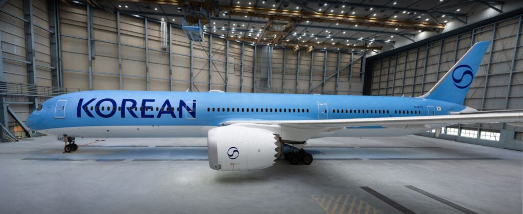
Funnily enough, that’s exactly what many ‘AVgeeks’ have said of Korean Air’s new logo and livery design after the Seoul-based carrier unveiled a Boeing 787-10 Dreamliner in its new look on Tuesday.
Korean Air has retained the iconic taeguk symbol as its logo but has reworked it in a Flat design with a single color. The airline says the new logo blends modern minimalism with timeless significance.
The airline has also created its own bespoke font, stepping slightly away from the cursive font that it once used for a much simpler typeface that will be as eligible on a mobile phone screen as it is when plastered across the side of a widebody airplane.
The Flat design ethos extends to other parts of Korean Air’s livery, with a single metallic sky-blue color now painted across much of the fuselage. Traditional livery design choices like the grey ‘cheat line’ have been replaced with a flowing curve of blue.
The reason for Korean Air’s rebrand isn’t just because the airline wants to get in on the Flat design trend. The whole exercise was spurred on by Korean Air’s acquisition of rival South Korean airline Asiana, which was recently completed after four years of scrutiny by competition regulators around the world.
For now, Asiana will be run as a subsidiary under its own brand until Korean Air rolls out its refreshed brand image. It’s hoped, however, that Asiana will be fully merged into Korean Air by early 2027.
AVgeeks will no doubt be mourning the loss of another classic livery that had withstood the test of time, but there might be some light at the end of the tunnel. There is talk that the Flat design trend might be nearing its end.
Talk of Flat design’s demise might be a little overhyped, but even Apple is reintroducing subtle elements of skeuomorphism to its latest iOS.

Hate it.
It couldn’t be more boring and uninspired. Well, I take that back – look how LH are looking these days. ow, just how much do people get paid to take a classic and unique livery and flush it down the loo in favor of boring excrement like this?
I couldnt agree more. Totally bland, boring, and looks as though they’ve taken a KLM / Tui fly / Neos aircraft on lease and stuck a couple of Korean stickers on it. Sadly, Korean has joined the likes of Lufthansa, Finnair and most miserable of all, SAS in ruining a perfectly good livery. How anyone in their right mind for example, could think that the current SAS scheme is an improvement on their classic Viking Longboat livery, is beyond me. Korean have made the same mistake by replacing a classic livery with something that looks like the design company spent all of 5 minutes on it. There was absolutely nothing wrong with the present livery – new is very often not best !! Whoever designed this new livery, and whoever in Korean sanctioned it, should be ashamed, for moving away from a stylish and beautiful liveryto this boring blue mess, which doesnt have any real connection to Korea, no colour contrasts and is stupifingly bland.